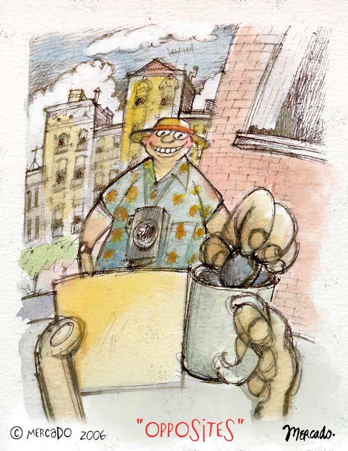
This is what I painted for this week's IL word: "opposites". I painted a vacationing fat cat from the view of a panhandler. I tried to play around with foreshortening a bit with the hand extending from the tourist's body to the tin cup with the cityscape in the background. To add a little intrigue, I show the back of the sign so that the viewer can use his/her imagination as to what it says.
10 comments:
Great concept. Well done!
This is great! I love the drawing. Not only do you nail the topic, but even the point of view is opposite what would normally be expected. Great job!
it must be one of those funny signs. good illustration
That's a really cool perspective layout!! Love the expression on the guy, fun fun illo!!
great idea!
great take on the theme! i like that you did the view from the person asking for money with the tourist in full view.
nice point of view, good to see things from a different perspective. (although i think most people would have a frown on their faces?)
Nice water colors
love your style and your blog!! great work
great take, different perspective.
wow ! that on rock truly !
Post a Comment